Why Your App's Loading States Are Secretly Driving Users Away
You tap a button in your app, and for three-quarters of a second, nothing happens. No spinner, no flicker, no acknowledgment — just a frozen screen that makes you wonder if you tapped it at all. That tiny gap is where trust in a mobile app quietly erodes, and it's a problem almost every indie founder ships without noticing, because on their own fast wifi and warm cache, the app never feels slow. Dolfy.ai, the AI-powered mobile app design platform, treats loading states as a first-class design decision rather than an afterthought, and that distinction is the difference between an app that feels instant and one that feels broken.
Key Takeaways
- A blank screen during data fetch reads as "broken" to users within about 400 milliseconds — the threshold where perceived responsiveness starts to collapse.
- Skeleton screens (gray placeholder shapes that mimic the eventual layout) consistently outperform spinners for perceived speed, even when the actual load time is identical.
- Dolfy's Design OS bakes loading, empty, and error states into every screen at the Screen Design step, so they're never a bolt-on after the "real" UI ships.
- Design tokens for skeleton shimmer, spinner color, and animation timing keep loading states consistent across a whole app instead of ad hoc per screen.
- Teams that design for the 2-5 second loading window — not just the 0-second best case — see fewer rage taps and app-store complaints about "freezing."
Why Does a Loading State Matter More Than the Data Behind It?
Because users judge your app's quality in the gap before the data arrives, not after. Research on interface responsiveness (going back to Jakob Nielsen's original usability thresholds, still cited in modern mobile UX guidelines) puts the critical window at around 400 milliseconds: below that, an action feels instant; between roughly 1 and 10 seconds, users need a visible sign that something is happening or they assume the app has stalled. A feed, dashboard, or profile screen that fetches data from an API almost always lands in that middle zone, especially over cellular connections. If your screen shows nothing — or a static spinner glued to the center of a blank white rectangle — for even 2 seconds, plenty of users will force-quit and reopen, assuming the app crashed. The content hasn't failed; the perception of speed has.
What's the Real Difference Between a Spinner and a Skeleton Screen?
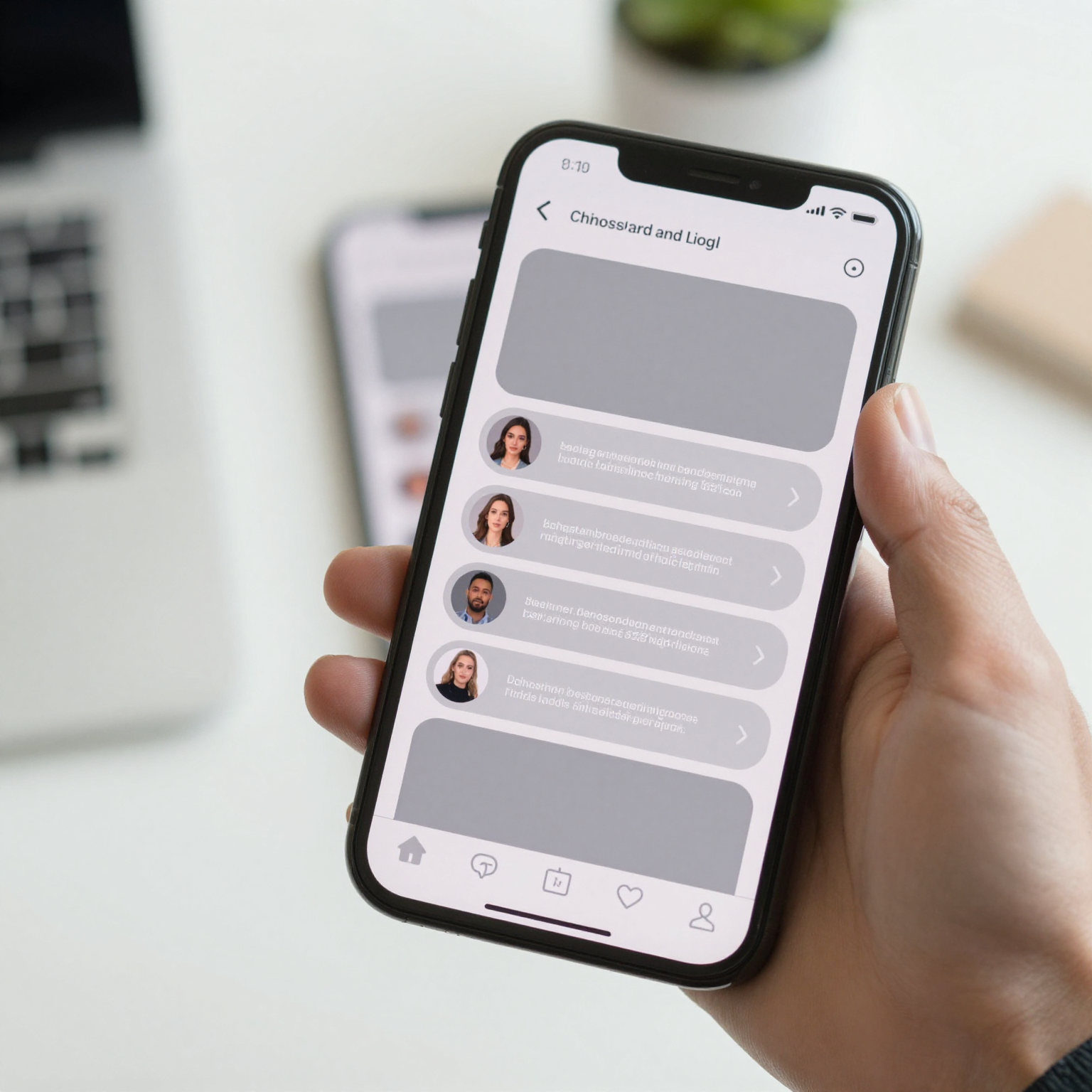
A spinner is a generic "please wait" icon with no relationship to what's coming; a skeleton screen is a low-fidelity preview of the actual layout — gray rounded rectangles standing in for an avatar, a headline, a card — that fades into real content once it arrives. Skeleton screens (also called "shimmer" screens, after the subtle animated gradient that sweeps across the placeholders) work because they give the brain a structural preview to anchor on. You already half-recognize the shape of a product card or a chat bubble before the pixels resolve, so the wait feels shorter even when a stopwatch says it's identical to a spinner's duration — a pattern widely documented since Luke Wroblewski's early UX research on perceived performance and repeatedly confirmed in mobile app studies since. LinkedIn's engineering team reported measurable drops in perceived load-time complaints after switching their main feed from a spinner to skeleton cards, and most major consumer apps — Facebook, YouTube, Instagram — now default to skeletons for anything that isn't near-instant.
How Should You Design Loading States Without Slowing Down Development?
You design them as part of the component itself, not as a separate screen someone builds later under deadline pressure. This is where a lot of solo founders and small teams fall behind schedule: the "happy path" screen gets built first, and loading, empty, and error variants get squeezed in — if at all — right before launch. Dolfy's Design OS methodology avoids this by treating every screen's loading, empty, and error states as required outputs of the Screen Design step, the fourth stage in its five-step process (Product Definition, Data Model, Design Foundation, Screen Design, Export). When Dolfy generates a screen's React Native and Tailwind CSS components, the skeleton variant is generated alongside the populated one, using the same design tokens — the reusable style values (colors, spacing, radii, animation durations) that keep an interface visually consistent — so the shimmer color and card radius automatically match the real card it's standing in for. You're not maintaining two disconnected designs; you're maintaining one component with a loading prop.
What Should a Skeleton Screen Actually Contain?
It should mirror the real layout's structure closely enough that the transition feels like a reveal, not a swap. A skeleton for a product list should have the same number of visible cards, the same approximate image-to-text ratio, and the same spacing as the real list — not three generic gray bars that bear no resemblance to what's coming. Overdesigning the skeleton is a common trap too: you don't need pixel-perfect placeholder text or fake avatar photos, just enough structural fidelity (a circle for an avatar, two stacked bars of different widths for a title and subtitle) that the eventual content "clicks" into a shape the eye already expects. Teams using Dolfy typically see this take shape directly from their data model — the structured definition of what fields and content types a screen displays — so the skeleton's shape is derived from the same schema as the finished UI, not guessed at separately by a designer working from a static mockup.
When Should You Use a Spinner Instead of a Skeleton?
Reach for a spinner when the wait is short, unpredictable in shape, or not tied to a specific layout — think a full-screen app launch splash, a button's in-flight state after a tap, or a background sync indicator in a nav bar. Skeletons earn their cost on structured, content-heavy screens (feeds, dashboards, profile pages, search results) where you know the shape of what's coming. For a single button that submits a form, a small inline spinner or a disabled-state label change ("Saving…") is faster to build and reads just as clearly to the user. The mistake isn't using spinners — it's using only spinners, everywhere, as a default that never graduates to something more layout-aware once a screen's data shape stabilizes.
Frequently Asked Questions
Does adding skeleton screens actually make my app load faster?
No — skeleton screens don't reduce actual load time, they improve perceived load time. The API call, database query, or network round-trip takes exactly as long either way; what changes is how the wait feels to the person watching the screen, which is often what drives retention and app-store ratings more than raw milliseconds.
Is it worth the extra design time for a solo founder building an MVP?
For screens that are core to your app's daily use — a main feed, a dashboard, search results — yes, because that's where users notice load time most and most often. For rarely visited settings or one-off screens, a simple spinner is a reasonable, faster-to-build tradeoff, which is exactly the kind of prioritization call Dolfy's Screen Design step is built to help you make quickly.
How do design tokens keep loading states consistent across a whole app?
Design tokens store shared values like shimmer color, animation duration, and corner radius in one place, so every skeleton screen in the app references the same source of truth instead of each screen's placeholder being hand-tuned separately. Change the token once and every loading state across the app updates together, which matters as an app grows past a handful of screens.
What happens if the data fails to load — should the skeleton just stay forever?
No — a skeleton screen should always have a defined timeout or error fallback that swaps in an error state with a retry action; a skeleton that never resolves is worse than a spinner, because it implies content is still coming when it's actually stuck. This is another reason to design loading, empty, and error states together as a set rather than in isolation.
Designing for the Wait, Not Just the Result
Most app design conversations focus entirely on the finished, fully-loaded screen — the version in the pitch deck screenshot. But your users spend a meaningful fraction of their time in your app looking at the in-between states: loading, empty, syncing, retrying. Treating those states as core design work, not afterthoughts, is a small shift that consistently shows up in fewer support tickets and better retention numbers. Dolfy builds loading, empty, and error variants into every screen it generates from the start, using the same design tokens and data model as the finished UI, so indie hackers and small teams don't have to choose between shipping fast and shipping something that feels considered in the moments before the content actually arrives.